Home
Our Process
Portfolio
FAQ
Where can I see your previous work?
Check out our portfolio at AppMakersLA.com/portfolio
What services do you offer?
We are a Los Angeles app and web development company. As such, we offer: 1) Design for Apps, Webapps and Websites 2) Mobile App Development for iPhone Apps, Android Apps and iPad Apps & Web Development for Webapps. Each project includes full QA Services as well as a product manager.
Where are your app developers located?

Our app developers are mainly located at 1250 S Los Angeles St, Los Angeles, CA 90015, though we have other offices around the world, and we hire the best developers wherever and whenever we find them. If having engineers & designers in Los Angeles is critical to the project, we have the resources to make that happen.

How much do you charge for your services?
Our cost varies depending on the project. Please contact us for a mobile app development consulting session and we will get you an estimate + analysis pronto.
Can you build software for startups?
Yes, we consider ourselves a startup app development company, as well as an agency that builds software for already established firms.

Discover 30+ more FAQs
View all FAQs
Blog
Contact ussms IconCall Icon
We answer our phones!
App Development / How iOS User...

How iOS User Behavior Shapes Feature Design

How iOS user behavior shapes feature design is straightforward: build from what people do in the wild, not what we hope they do. 

In the data, 78% of users update quickly, yet 72% still hesitate when battery life or performance feels at risk. That’s your cue to treat stability as a feature, ship in small, predictable increments, and stage big UI shifts behind feature flags and gradual rollouts. Then let analytics confirm the real patterns in which microinteractions get used, where friction shows up, and whether users can pick up a task without re-learning the flow. 

The sections below break down the specific design moves that consistently lift retention and conversion.

Key Takeaways

  • Design iOS features around real behavior, not internal assumptions, especially in short, distracted sessions.
  • Treat stability as a feature. Ship predictable releases and stage bigger changes with feature flags and gradual rollouts.
  • Make search and empty states do real work by guiding discovery and first actions instead of acting like dead ends.
  • Build for interruptions. Autosave, preserve state, and let users resume without redoing steps.
  • Monetize with restraint. Offer clear value, keep paid experiences calm, and avoid punishing payers with ads.

The iOS Update Reality and What It Means for Features

a split infographic where the left side shows a simple version share chart plus two bars for “update now” (38.8%) vs “delay” (61%), and the right side shows 4.2 hours/day with three stacked blocks (social, entertainment, gaming)

Even before you design your first screen, it helps to understand how iOS users behave around updates. On newer devices, adoption of the latest iOS 18 minor versions is strong, but it is not uniform.

StatCounter’s version still shows a mixed landscape. It puts iOS 26 variants at 16.3% worldwide and 4.9% on 26.0, while iOS 18.6 and 18.7 hold roughly 63% combined. In the U.S., 51.71% remain on 18.6.

The behavior behind those numbers is where product teams feel it. Only 38.8% update immediately, while 61% delay, dismiss, or assume it will happen automatically. Hesitation is normal. 72% cited at least one concern, including battery drain, performance issues, design changes, and fear of bugs. For teams building on both iOS and Android, that fragmentation affects parity decisions and rollout strategy, especially when you are shipping features that cannot break. 

That’s also why teams like AppMakers USA plan releases with staged rollouts and controlled exposure, not a single all-users push. When speed matters, some teams lean on low-code prototypes to test flows faster before committing to full builds.

Mobile time is big enough that tiny UX decisions start to matter. Sensor Tower’s 2025 State of Mobile report estimates consumers spent 4.2 trillion hours across iOS and Google Play apps in 2024, which is about 3.5 hours per day per mobile user.

What that means for feature design is less glamorous than the number. People are usually in quick, distracted sessions. They bounce between a small set of “default” apps, and they notice friction fast. So the basics do a lot of heavy lifting on iOS: fast launch, clear first action, state that stays put when they come back, and a flow that does not punish them with resets, surprise prompts, or extra taps. 

If your app fits into those daily habits, you do not need gimmicks to keep engagement. If it fights them, no amount of features will save it.

Designing for Search, Continuity, and iPhone Habits

four tiles shows one small iPhone UI sketch and a one-line outcome

When you design for how people actually use an iPhone, your feature decisions get cleaner. Search stops being a last-resort box. Empty states become the first real onboarding. Continuity does the quiet work of keeping users moving, even when life interrupts them. And you get reliable return paths that do not depend on notification spam.

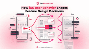
Most “iOS behavior” shows up in four places that decide whether your app feels effortless or annoying. These are the moments users hit every day, often in short, distracted sessions, so we break them out separately: discovery, first-run guidance, continuity, and feedback.

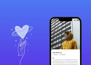
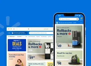
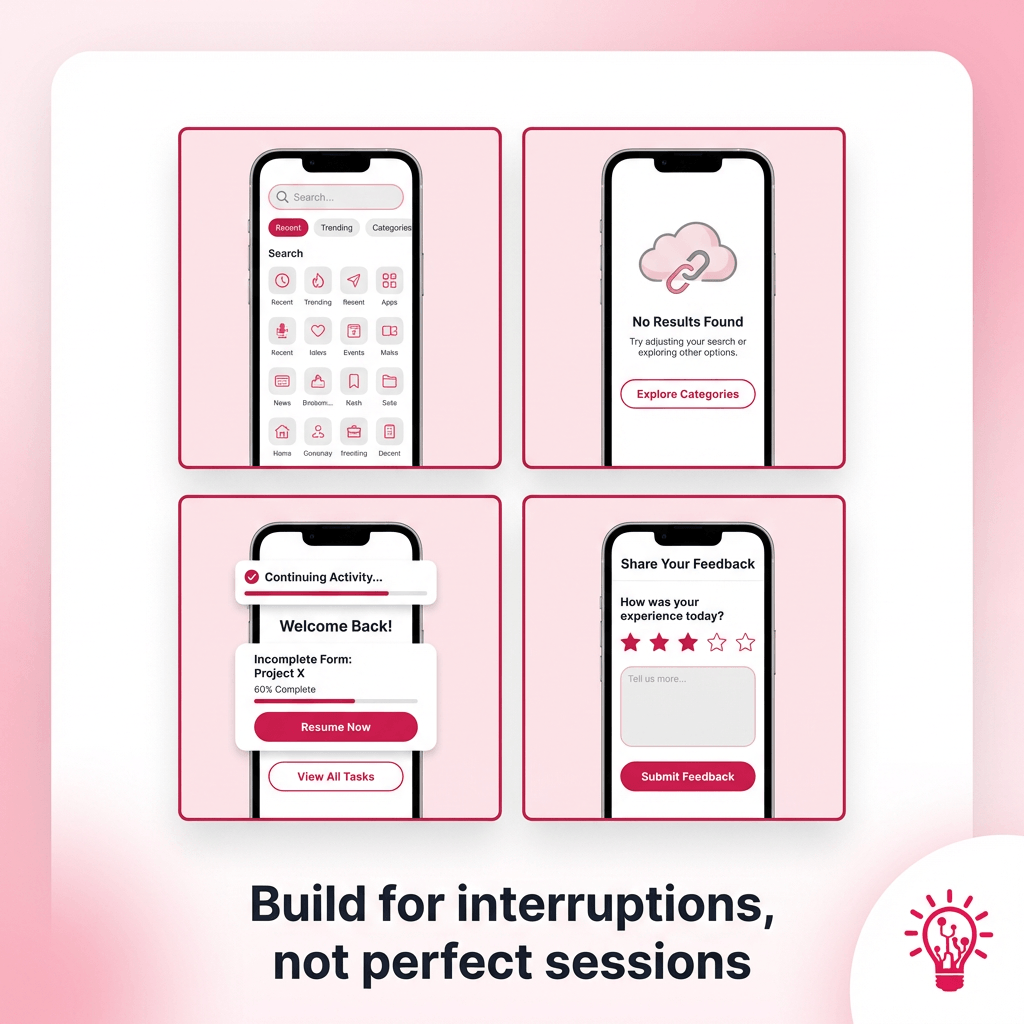
Discovery and search

Treat search like a front door, not a utility. Show recent searches, suggested queries, and a few popular filters right away so users can “browse by typing” without committing to the perfect keyword. If results are thin, give them a graceful fallback like categories, trending items, or “people also looked for” suggestions.

First-run and empty states

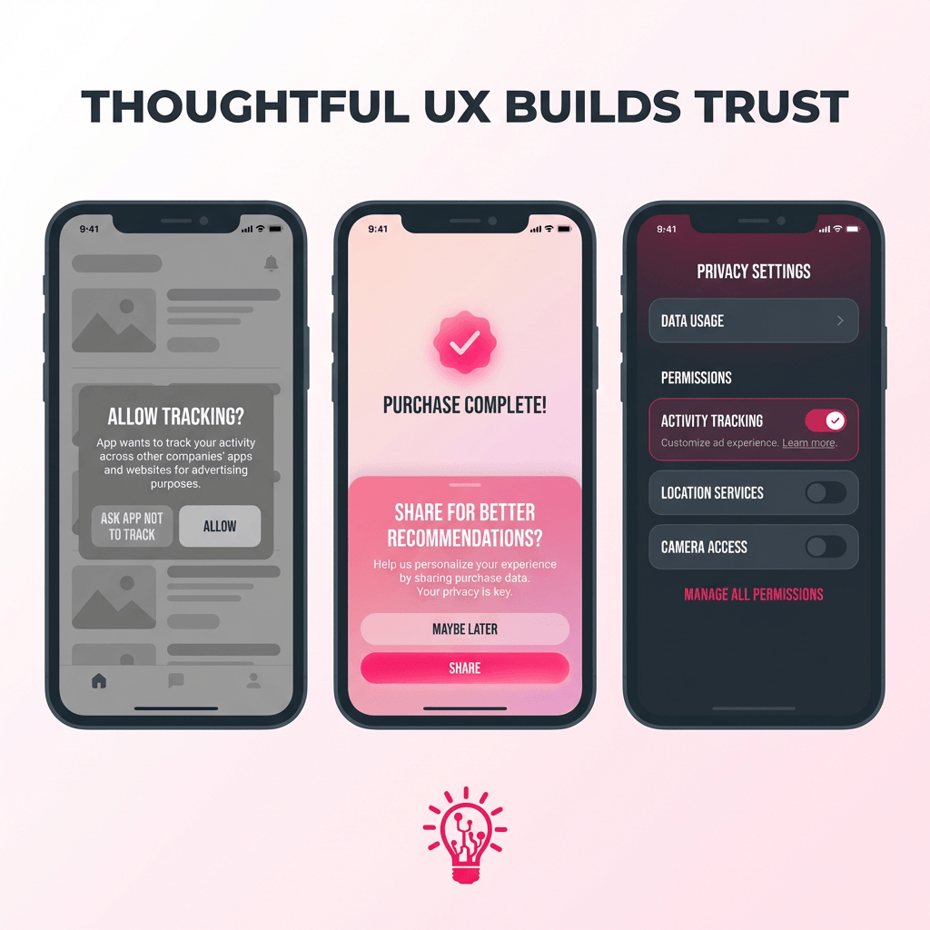
Empty states should push the user forward. Give one clear next action, a short line that explains the value, and an example state when possible. If your app needs permissions, ask after the user sees why it matters. People accept prompts more easily when they already got a win.

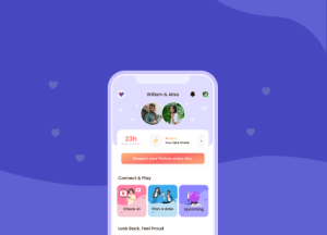
Continuity and saved state

Assume interruptions. Calls, Face ID fails, a quick app switch, low battery. Save progress automatically, preserve drafts, and let users resume mid-flow without redoing work. A simple “Continue where you left off” pattern beats trying to re-engage them later.

Microinteractions and feedback

iOS users notice feedback. Use haptics on high-frequency actions, confirm state changes clearly, and keep loading indicators honest so people know the app did not freeze. Subtle visual changes, selected states, saved checkmarks, progress cues, keep users oriented without shouting at them.

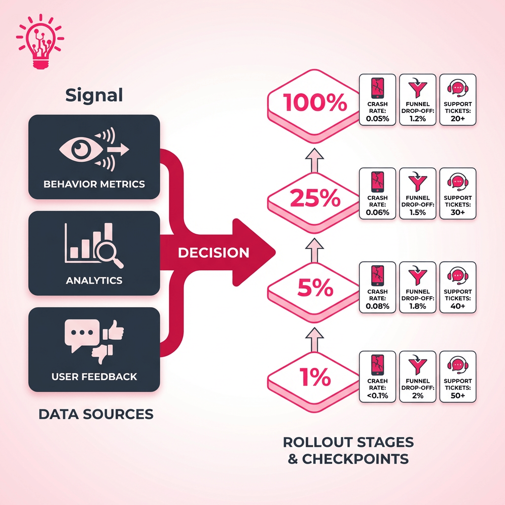
At AppMakers USA, we bake these behaviors into specs and prototypes, then validate them with analytics and usability testing before scaling a rollout. If AI-driven personalization makes sense, start small with context-aware suggestions based on what the user just did, not a “magic AI” layer that changes the UI every time.

Permissions, Privacy, and Trust Moments on iOS

a simple 3 panel UX mock

On iOS, privacy is not a legal sidebar. It is part of the UX. The exact moment you ask for tracking, notifications, photos, or location is when a user decides if your app feels legit or sketchy.

Start with restraint. Track only the events you truly need to improve the product. Skip anything that looks like fingerprinting. If you are measuring first party engagement, keep it first party. When a vendor pushes you toward “creative identifiers,” that is usually a sign you are about to create a compliance headache for marginal upside.

For ATT specifically, do not treat it like a mandatory pop up on first launch. It lands better after the user sees value. Use a short pre prompt in plain language that explains what you are asking and why. Then give the system prompt. If they say no, your app should still work. Make “no” a real path, not a penalty box.

The same logic applies to notifications and location. Ask when the feature is being used, not on the splash screen. People accept prompts when the timing makes sense. They ignore them when it feels like you are grabbing permissions just because you can.

Behind the scenes, keep your data house clean. Document why you collect each event, limit retention, support deletion requests, and audit your analytics and ad SDKs. Also plan for edge cases like underage users and managed devices, because those show up faster than teams expect.

AppMakers USA design consent flows and analytics setups together, so product decisions stay grounded in real behavior without turning privacy into a risk magnet.

Monetization on iOS That Does Not Feel Like a Cash Grab

three lanes labeled as Free, Subscription, and Add ons

Now that we’ve covered how iOS users use apps day to day, the next question is what they will actually pay for and what makes them bounce.

iOS users tend to spend more inside apps. One AppsFlyer report found iOS users spend nearly 2.5x as much as Android users in monthly in-app purchases per user, per app. That does not mean you should slap a paywall on everything. It means the upside is real if your paid experience feels clean, consistent, and worth it.

Start by isolating your high LTV cohorts and sanity checking the math. A simple rule of thumb is you want LTV to comfortably beat CAC, not barely tie it. Then design monetization around what those users already do. For a lot of consumer apps, that ends up as a hybrid model: free access that gets users to the “aha,” a subscription tier for predictable value, and add ons for on demand intent. Dating and social apps are the obvious example. Subscriptions handle the baseline, and one off boosts or premium interactions capture the “I want this now” moments without wrecking the core experience.

Ads can still play a role, but be deliberate. If someone is paying, do not keep punishing them with ads. You will cannibalize your own revenue and annoy the exact users you want to retain. Segment payers vs non payers, throttle aggressively for the free tier, and keep the paid tier calm.

We usually wire those monetization levers into the architecture and analytics early at AppMakers USA, so pricing and packaging become measurable decisions, not guesswork you tack on later

Turning iOS Signals Into a Shipping Plan

a table plus rollout diagram that shows the concept of Signal → decision → rollout

At this point you have the signals. The roadmap move is using them to sequence risk, not just add features.

If upgrade prompts make users nervous, ship changes like you are earning trust every release. SellCell’s January 2026 survey shows only 38.8% update immediately, while a meaningful chunk waits to see if other people get burned first. That is basically a free rollout strategy. Start with a small cohort, watch crash rate and key funnels, then widen the ring.

One caution. Third party “iOS version share” dashboards can be misleading right now. Safari changed how it reports parts of its user agent string, which caused some services to undercount iOS 26 and overcount older versions. Treat external charts as directional and sanity check them against your own telemetry before you bet a quarter’s roadmap on them.

SignalWhat it provesRoadmap move
Most users delay updates (about 61%), and many wait for social proof (27.2%)OS updates feel risky, so big changes need trust and runwayFeature flags, staged rollouts, and release notes that explain impact in plain language
iPhone owners commonly keep devices 2 to 3 years (61% in one dataset)Your user base spans multiple performance tiers at once​​Performance budgets, graceful fallbacks, and QA on older devices before you ship “nice-to-have” polish
iPhone loyalty is high (89% for the 12-month period ending June 2025)Retention compounds when the experience stays consistentInvest in iOS-first polish that supports daily habits, then add parity features when the data demands it

For San Diego product teams, these signals should also guide how you plan and validate AI-powered agents that automate support workflows and drive smarter feature experimentation.

Run the loop the same way every time. Instrument the flows that matter, segment by OS and device tier, ship small, then widen only when the data says it is safe.

Aaron Gordon

Aaron Gordon

Aaron Gordon is the Chief Operating Officer at AppMakers USA, where he leads product strategy and client development, taking apps from early concept to production-ready software with high impact.

Ready to Develop Your App?

Partner with App Makers LA and turn your vision into reality.
Contact us

Frequently Asked Questions (FAQ)

Use feature flags and staged rollouts. Start with employees and a small cohort, watch crashes and key funnels, then expand. If it backfires, you can pull it fast without a public meltdown.

Not always. Keep the core value consistent, but let the platforms diverge when user behavior or OS capabilities justify it. Parity for parity’s sake usually wastes time and ships weaker features on both sides.

Look at your own analytics, not just public dashboards. Break it down by your paying users and your highest retention users, then set a floor that matches your performance targets and support capacity.

State persistence. Autosave drafts, keep the last viewed screen, and resume mid-flow after interruptions. Users rarely compliment it, but they absolutely notice when it’s missing.

Default to native when the pattern is common and users already have muscle memory for it. Go custom when it clearly improves the core job and you can maintain it without breaking accessibility, performance, or expected behaviors.

See more
Chevron-1

Build for iPhone Habits, Not Assumptions

iOS users are not hard to design for, but they are quick to punish sloppy execution. They update faster than most platforms, yet they still hesitate when battery, performance, or bugs feel like a risk. They live in short sessions, get interrupted constantly, and expect your app to remember where they left off. They also have a strong willingness to pay when the value is obvious and the experience stays calm.

So the “smart” move is not piling on features. It is shipping stable releases, timing permission asks after value, keeping core flows one or two taps away, and rolling out bigger changes in controlled slices with real telemetry behind it. Do that consistently and you earn trust, retention, and revenue at the same time.

If you want a second set of eyes on your iOS roadmap, rollout plan, or monetization flow, AppMakers USA can help.


Exploring Our App Development Services?

Share Your Project Details!

Vector-60
We respond promptly, typically within 30 minutes!
Tick-4
  We’ll hop on a call and hear out your idea, protected by our NDA.
Tick-4
  We’ll provide a free quote + our thoughts on the best approach for you.
Tick-4
  Even if we don’t work together, feel free to consider us a free technical
  resource to bounce your thoughts/questions off of.
Alternatively, contact us via phone +1 310 388 6435 or email [email protected].
    Copyright © 2026 AppMakers. All Rights Reserved
    Follow us on socials:
    linkedin facebook pinterest youtube rss twitter instagram facebook-blank rss-blank linkedin-blank pinterest youtube twitter instagram